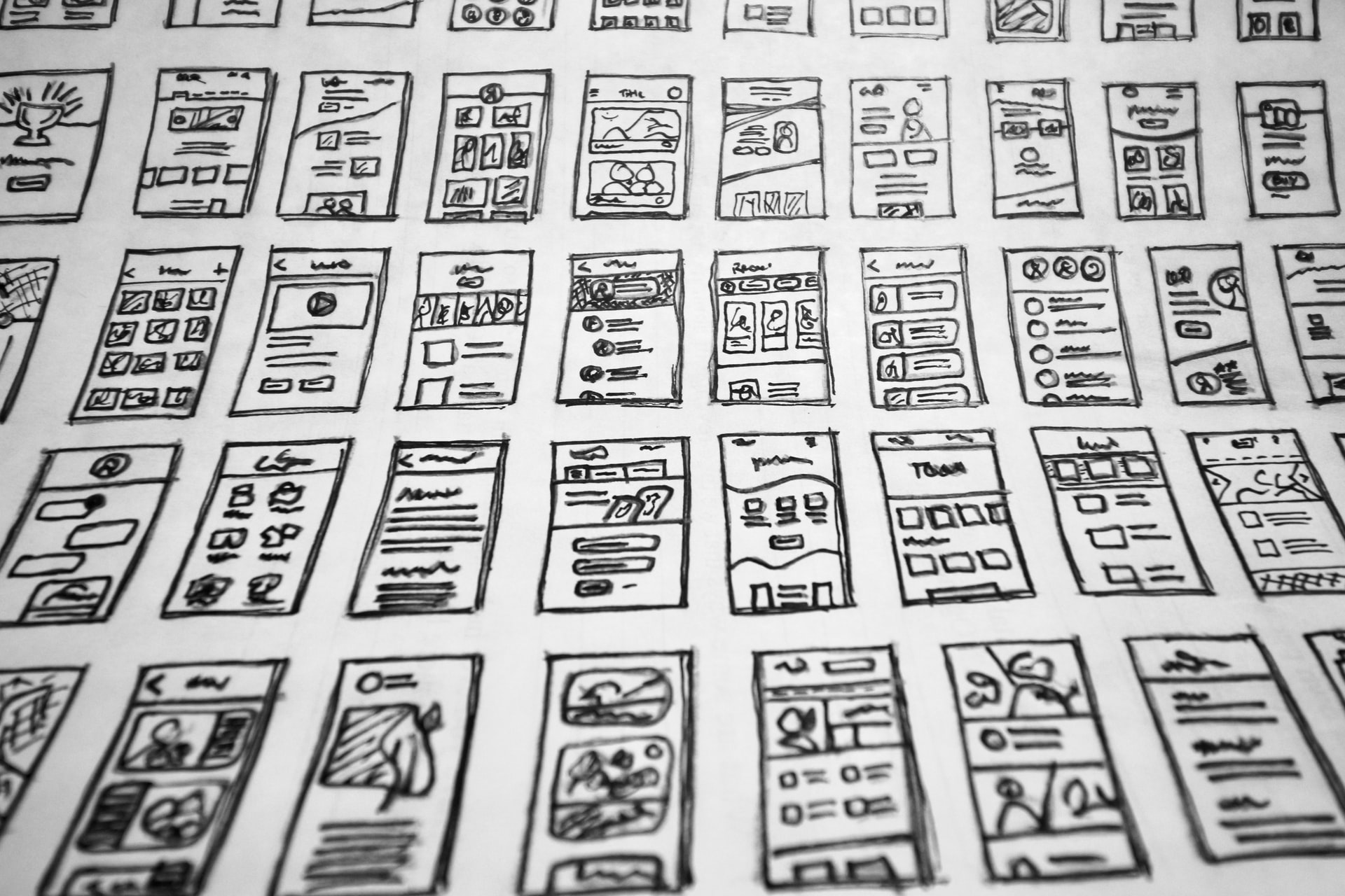
Are you attracted to a page of just plain text?

In this post we look at the different elements that make up a web page.
Web Pages consist of many different elements. Some of which really enhance a page and help to easily navigate and flow through each page with ease.
The aim of many pages is to help users find the information they need or keep the user on the page long enough to show them your products or services.
Our top elements are listed below.
1. Content
Having lines and lines of text provides no break or rest for the user reading. The person reading is more likely to navigate away from the page rather than consuming your content. Text or paragraphed text makes up around 80-90% of the page. Having clear sections, breaks and limiting the number of words per line will keep your readers naturally flowing through your content.
2. Fonts
You want to make your text more appealing. Having a plain text font can help when creating paragraphs. On the odd occasion you may want to change up your fonts to help bring some character to the theme of your page.
Using standard fonts i.e. browser fonts such as “Times” can make your text look very outdated. With the injection of other standard fonts for example “Arial” it can drastically change the look of your page.
3. Layout and Spacing
Having great text and fonts are only part of the answer. Having a consistent layout with good spacing can really transform your page. Keep text spaced between images and other blocks of text. This will help your readers to naturally flow through your content without having to work too hard.
4. Colours and Contrasting backgrounds
Colours play an important part in how your eye reads and processes information. Keep body text an off-black shade on white backgrounds to help with reading. The contrast will make the text more readable.
Font colours also play a key role in highlighting groups of text or information. This can be seen when text is highlighted to show “tips or tricks” or highlighting important points of reference. Background colours on text can also be used in the same way. Be sure that the colour contrast works with your text colour.
5. Images
Nobody wants to read a lengthy piece of text. With the use of images the text can be broken up throughout the body of the content. This is a good way to present your information in a different way and will help your readers to understand your information more easily. Having header/hero images sets the tone for your content and give the reader some insight before diving in!
Conclusion – Key elements to an attractive looking web page.
Going back to my original question. Are you attracted to a page of just plain text?
No one likes a page of just plain text. It doesn’t excite the reader or help with the user experience.
Having pages that are properly laid out, contain the spacing, font, colour and images will drastically help readers to stay engaged with your content.
In a world of highly competitive information and content, it really make sense to keep your pages consistent and attractive. This will ultimately keep visitors on your pages for longer and also keep them coming back.
Let us know your thoughts on content strategies and campaigns that have worked for you?
If you need help working on these then please get in contact. We work with many website and SEO client related services.
If you liked this article, then please like, comment and share…..you can also find us on Twitter and Facebook.

